Case study, Boneheads BBQ
Low and slow is for the brisket, not the website.
Boneheads BBQ has been smoking on Barrington Street in Halifax since January 2010, voted best ribs in the city by The Coast’s readers every year since. The old website took seventeen seconds to show up on a phone, and the menu on it was a picture. Belair Creative rebuilt it, photographed the room, and put the menu, the ordering, and the catering requests where customers actually are: on a phone. What was broken, what it cost, what changed.
3 s
for the site to show up on a phone. It was 17.
0
menus or QR codes that had to be reprinted
100
out of 100 on Google's site checks, every page
1
login the owners use to change hours and mark things sold out
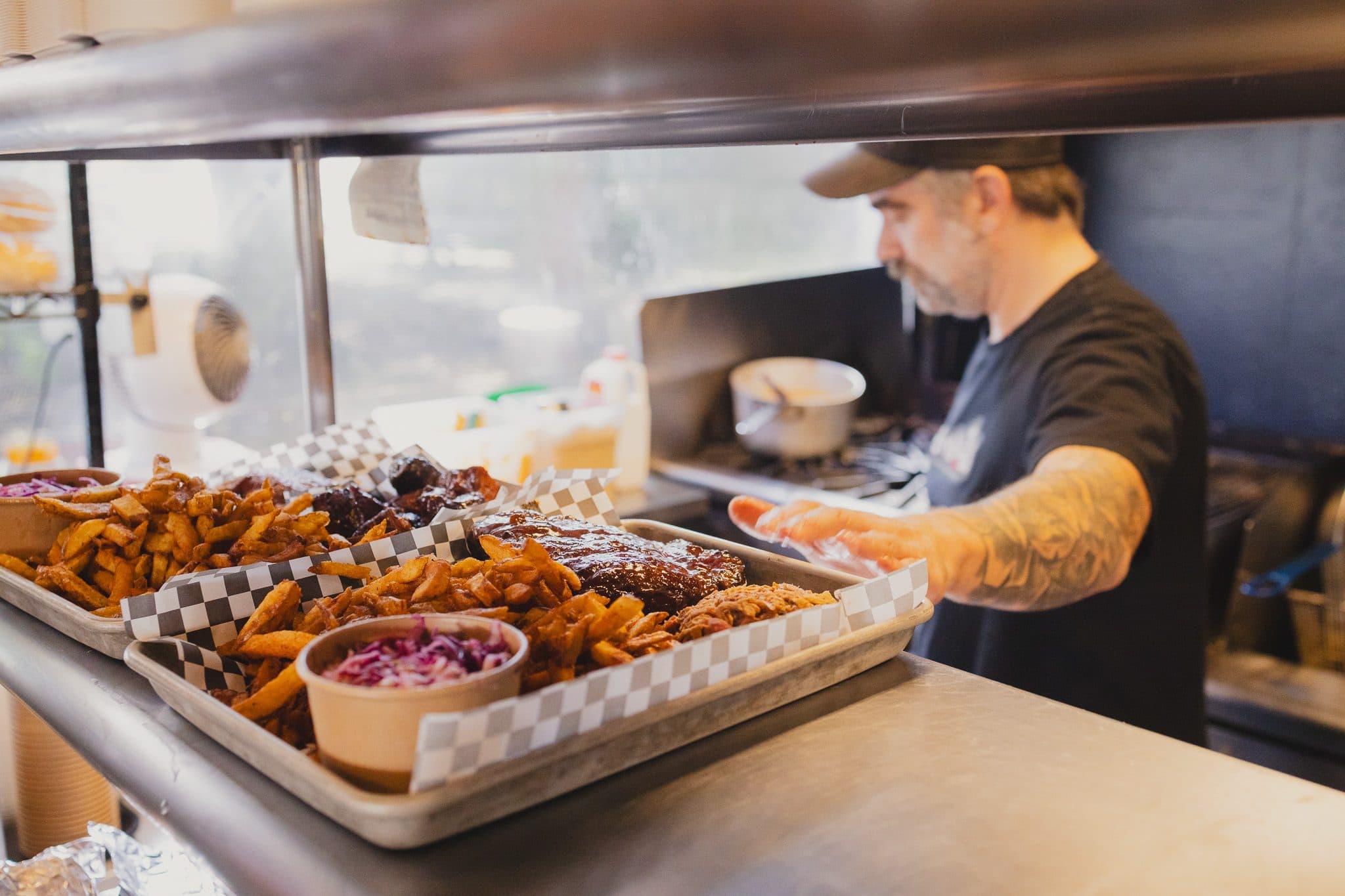
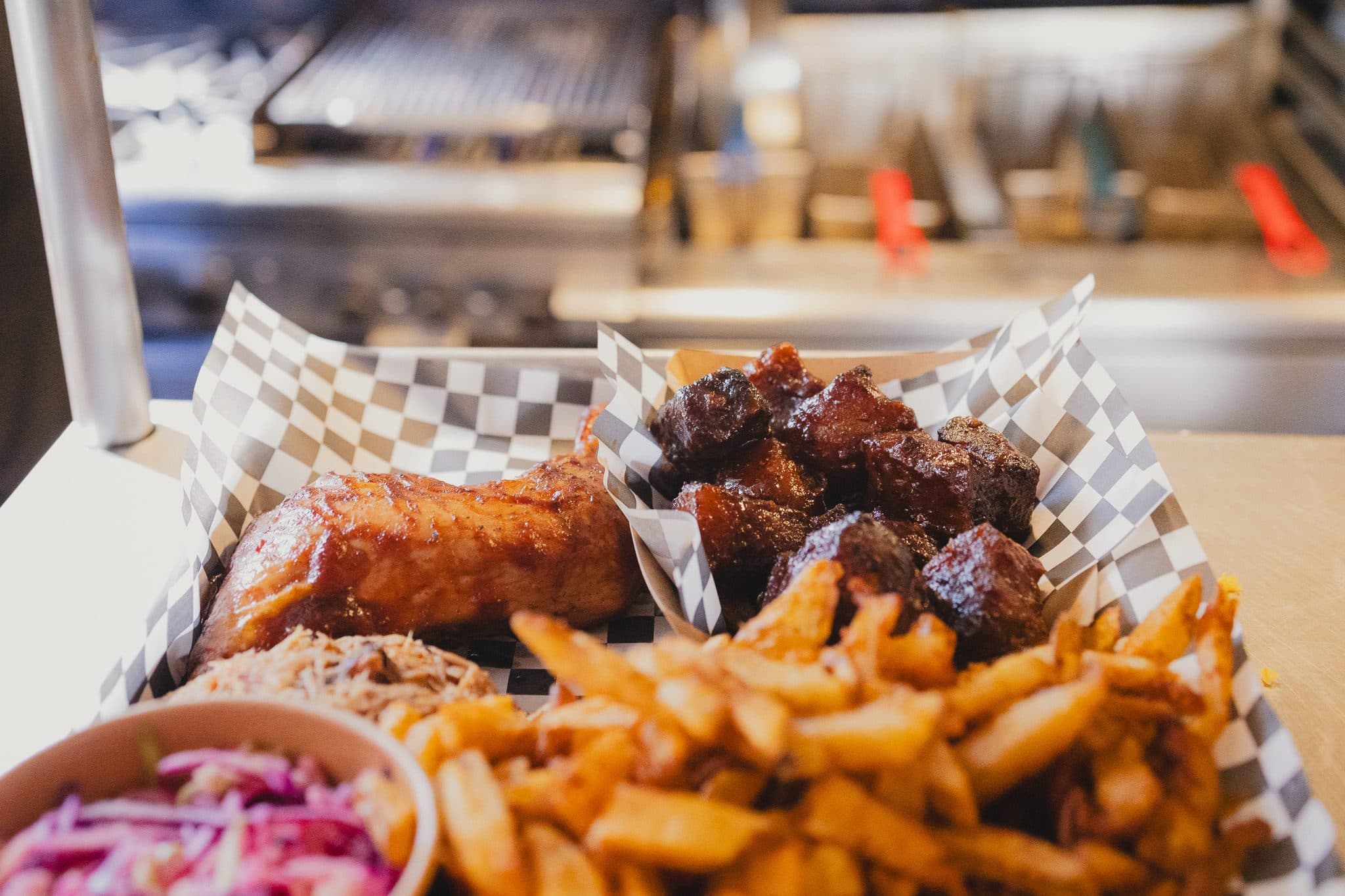
Trays loaded at the pass. Photographed on site for the new site.
What was broken
A one-page site from 2017, with the menu as a picture.
The food had done its job for sixteen years. Food Network put the place on television, The Marilyn Denis Show named it among the best barbecue in the country, and the sign out front needs no introduction on Barrington Street. The website was built around 2017 and left alone after that: one long page, with a copyright line still reading 2018.
The menu was a photo of the printed menu. The phone number was on the takeout menus but nowhere on the site. And the menu customers actually ordered from online had moved on, with new items and new prices, while the website still showed the old one.
On a phone, the site took seventeen seconds to show up. The page was almost all pictures, and big ones. Most people give up well before that.
What it cost
Every search for the menu ended in a zoomed-in photo.
A restaurant website has one job most of the time: someone is hungry, on a phone, and wants to know what you have, what it costs, whether you are open, and how to order. A menu stored as a picture answers none of that to Google, to Maps, or to the assistant more and more people ask instead. It cannot be searched or read out. It can only be pinched and zoomed.
Then there is the gap between the menus. A customer who priced a platter from the website and paid a different number at checkout is a customer with a small grievance, and small grievances are what reviews are made of.
The quiet cost sat in catering. Catering is half of what Boneheads does and where the larger orders are. Every request started as an email with no shape to it: how many people, which meats, roughly what it comes to. The owner answered each one by hand before anyone had committed to anything.
What changed
A real menu, a real order button, and the owners’ own words.
A new site built from scratch: home, menu, order, catering, about, and visit, with photos shot on site and a simple login the owners use to make changes themselves.
A menu that is a page, not a picture
Every item and price is typed out on the site, taken from the menu customers actually order from, not the old PDF. Google can read it, Maps can show it, and anyone asking their phone what Boneheads charges for ribs gets an answer. When something sells out, it drops off. The printed menu is still there for anyone who wants it.
The printed QR codes keep working
Every table card and takeout menu has a QR code pointing at the old web address. That address now lands on the new order page, which opens the ordering menu straight away. Nothing had to be reprinted.
Catering priced before it is sent
Catering is half of what Boneheads does, and the money is in it. The catering page works like a planner: pick the meats and sides, say how many people, and it works out the portions and a draft total. The request arrives with that draft attached, so the owner confirms a number instead of building one from scratch.
Hours and sold-out in the owners' hands
The owners log in from a phone to change the hours, add a holiday note, mark an item sold out, or swap a photo. If they leave something blank, the site keeps what was there before, so nothing they do can break the page.
Designed like a butcher shop, in their words
Paper, ink, and the red from their sign, used only on the order button. The headline type matches the lettering on the sign out front. The words are theirs: the lines on their walls, the 14-hour brisket, the beer in the gravy. It looks like the shop, not like a template.
One change at a time
The online ordering they already had stays in place through launch. Moving it to the system that runs their till comes a week later, behind the same order button. If something goes wrong, it is obvious which change caused it, and staff learn one new thing at a time.
Before and after
Same restaurant, same tray of food.
The old home page was a photo with a sign pasted on it and a navigation bar underneath. The new one says what the place is, shows the hours and the phone, and puts the order button where a thumb lands.
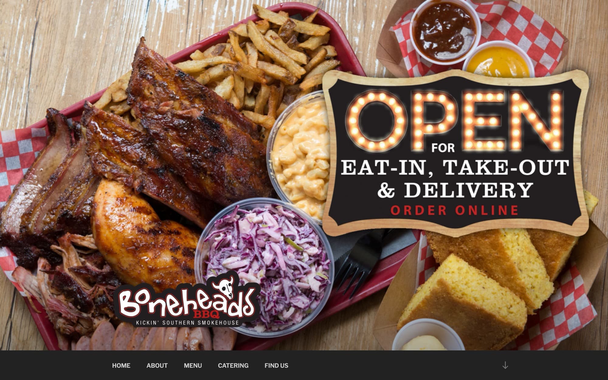
Before. One page, the menu as a picture, no phone number.
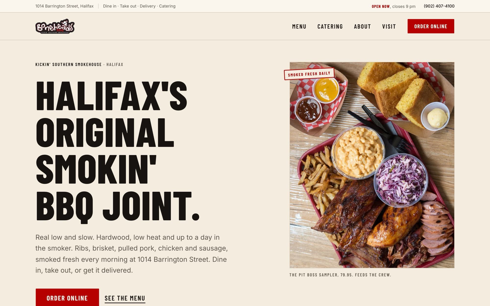
After. Open now, closes at nine, phone, order. Then the food.
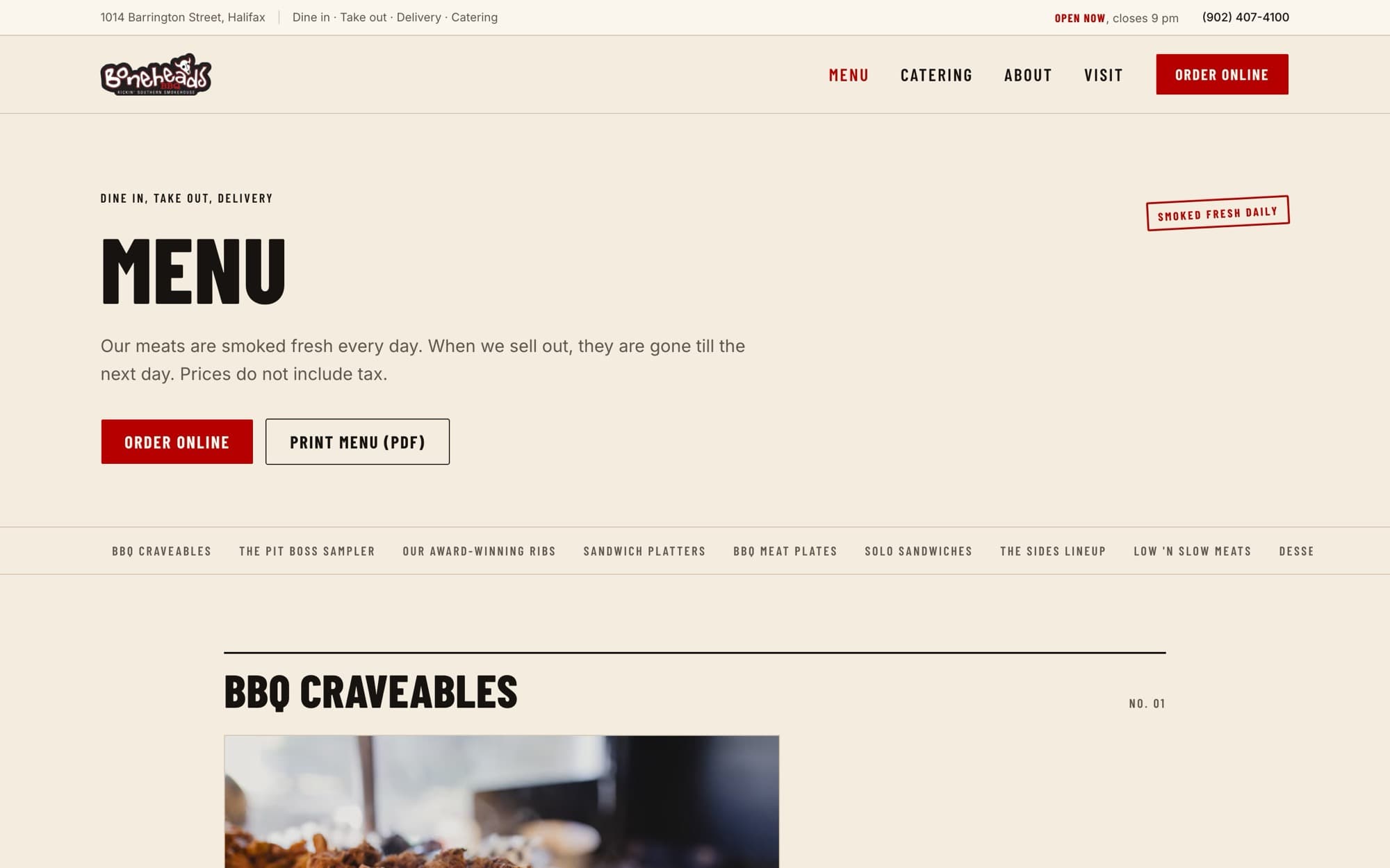
The menu, as a page. Every item and price is typed out, so Google and your phone can read it.
The place
Photographed as a butcher shop.
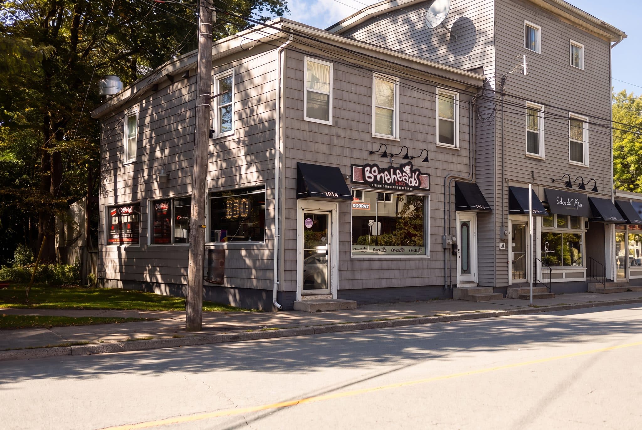
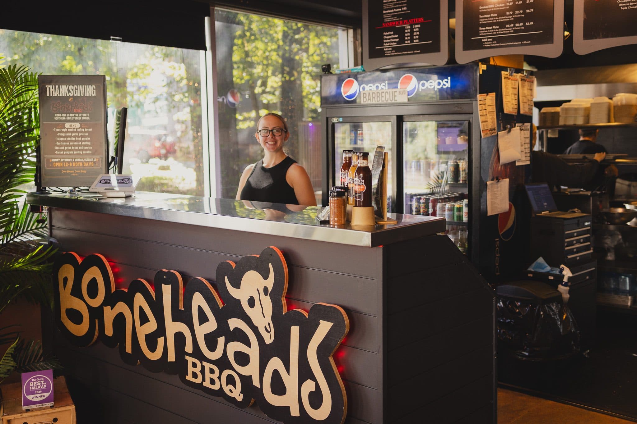
The photography was part of the same build. The corner, the counter, the pass, the sign on the red wall, and the plates as they go out, shot on site and placed straight into the pages. Nothing pasted over them, no filters.
The P&L after
Where the money shows up.
Catering requests now arrive with a headcount, a list, and a draft total the customer has already seen. The owner confirms a number instead of building one, and the people who send a request are the ones who have already looked at the price.
Every order placed from the site goes through the restaurant’s own ordering account, not a marketplace that takes a cut, and once ordering moves to the till, the menu is typed once instead of twice. A sold-out item disappears from the site when it sells out, not when someone remembers.
There is nothing to keep updated and no one to email when the hours change. The site costs little to keep running, with nothing to renew but the web address. The site itself, the login, and every photo from the shoot belong to the restaurant.
The site is built and running at a preview address while the owners sign off. Their web address moves over after that, and the ordering switch follows a week later.
Does your menu live in a PDF?
Restaurants, shops, and studios: if your customers find you on a phone and your site was built for a desk, there is revenue in the gap. We build the fix, shoot the photos, and train you to run it.